What Does the UN Want to Correct on the World Map, and How Will It Affect Belarus?
BY | EN
[DOI:]
IMAGO.by
14.09.2026
What Does the UN Want to Correct on the World Map, and How Will It Affect Belarus?
The story of the UN resolution on the “Correct Map” and fair proportions of countries - above all Africa and Latin America - is strange in its incompleteness. Strange because at first it seemed not to live up to journalists’ expectations. When it comes to maps, there are always borders, and given the times we live in - claims and territorial disputes. But the first reports were a mix of dull Wikipedia-style articles and speculation, for example, that France was actively supporting the initiative, perhaps in order to improve relations with its former colonies.
Ukraine’s objection that Crimea is shown in “neutral gray” and that this is a dangerous precedent – this stirred up some interest. But, strictly speaking, the objection was not directed at the UN, which proposed only replacing the Mercator projection with Equal Earth, but at the fact that the people who developed the projection are, in practice, offering not merely a projection but a political map on which Crimea is marked according to unclear rules (although the authors write that they used open sources and cartographic materials from the US government).
In fact, during the debate it was emphasized that the resolution was not connected with the Equal Earth development team and had nothing to do with borders. But this ambiguity (is it a projection or a map?) in the project of the Equal Earth developers led to a situation in which Japan, which did not take part in the debate but simply supported the resolution, eventually discovered that although it had voted for the projection, it had also received the Kuril Islands – distinctly not “neutral gray.”
Unfortunately, no map that satisfies everyone has yet been invented. And the Equal Earth team can be understood: a projection is difficult to sell, while a political map is easier.
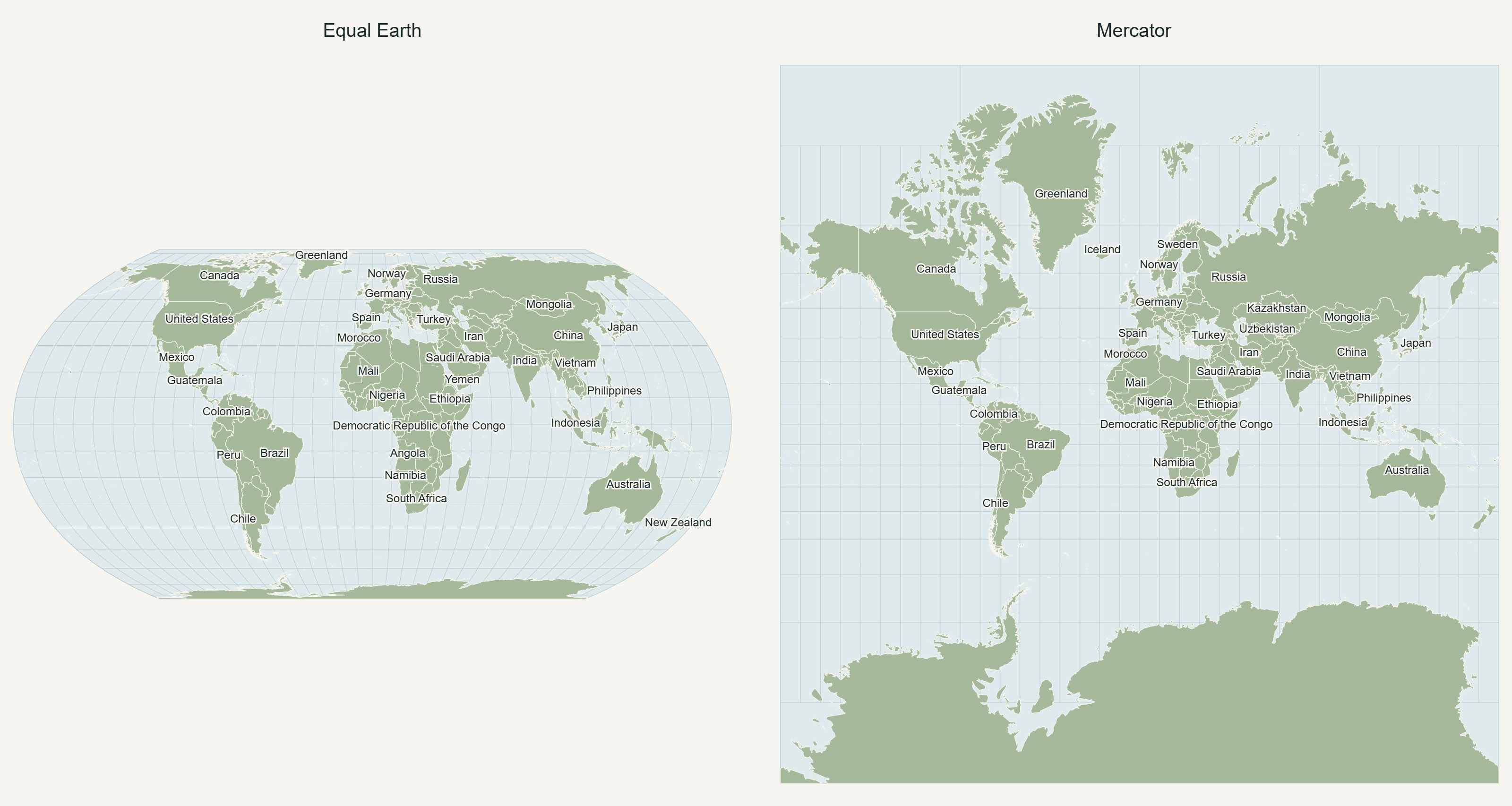
How the “Correct Map” Came About
When politicians start taking an interest in maps, it is the first sign that you should check the expiry dates on the canned food in the bunker. In the sense that maps have often reflected global political and social changes throughout human history.
In short – for now, we can breathe easy. But if you are interested in the role of maps and the power of their influence, let’s take it apart piece by piece.
The news about the new “correct” or “proper” map quickly spread through the media, which were looking for a global subtext or political implications but, it seems, found none. Instead, readers could learn about the Mercator projection, Mercator himself, and his maps and atlases.
The main goal of the “Correct Map” is to show the African continent at its true size. On such a map, Africa really does look somewhat larger than on Mercator maps, and only slightly larger than on other, more accurate projections that are already quite widely used. The resolution itself is recommendatory in nature – primarily for government, academic and educational institutions, and even global technology platforms.
To begin with, we have to accept that there is no perfect map projection. Throughout history, it has been necessary to choose a particular way of representing the surface of a round planet on a flat plane – according to one’s needs. The projection developed by Mercator in the sixteenth century became one of the most widely used. But today, this model is no longer as necessary in itself.
The Mercator layout “took off” precisely because, given the knowledge and instruments of the time, it allowed sailors to plot an approximately straight route on a map. This was especially convenient over long sea distances: you sail according to the compass and can mark your route on the map with sufficient approximation.
At the same time, the Mercator projection greatly distorts the size of territories: as one moves away from the equator, the surface “expands.” It is rather like stretching a ball over an empty cylinder: the ball would be stretched most at the top and bottom of the cylinder.
Remember Greenland on the map? It lies in northern latitudes and is therefore greatly stretched. On maps, it looks comparable in size to Australia and even Africa. But in area Greenland is about three and a half times smaller than Australia and fourteen times smaller than Africa.
In short, over time we forgot about that original convenience, but almost everyone remained satisfied with this picture of the world.
So What Actually Happened Behind the UN’s Walls? Why Did a Different Idea “Take Off”?
The Equal Earth projection preserves the actual relative areas of continents on the map. This is not a scientific discovery – equal-area projections have been known for a long time.
The initiative to promote the “Correct Map” and give it a certain preference over other projections came from African states. At the session, the resolution was presented by Togo, and the document itself specifically mentions the African Union initiative Correcting the map of Africa on the globe.
In looking for that same political subtext, it is interesting to note the factors that have called the traditional and familiar Mercator model into question. And these are entirely about value categories.
The resolution states that cartographic representations have a lasting influence on the perception and understanding of territorial realities on a global scale, cartographic distortions of sizes of continents, inherited from history, have contributed to their incorrect perceptions, leading in particular to a symbolic minimization of Africa in collective imaginations and knowledge systems.
Another formulation is that Mercator distortion contributes to minimizing the perceived sizes of Africa, Latin America and South Asia, and perpetuating an unbalanced view of the world.
And the strongest formulation of all: correcting cartographic distortions of continental sizes constitutes an act of cognitive justice and memorial reparation, understood as promoting accurate geographical knowledge, as well as historical truth, education and awareness-raising, and promotes mutual understanding among peoples.
The list, in fact, is very long.
This rhetoric suggests that, essentially, what we have before us is an act of decolonizing geographical perceptions. The main themes are Africa and Latin America. At the same time, the correction of the map itself is called “cognitive justice” and “memorial reparation.”
And What Is Actually Being Proposed?
According to the resolution, states, international organizations, and other relevant institutions are “encouraged to adopt, disseminate and use the Equal Earth cartographic projection”. Global technology platforms are encouraged to engage in constructive dialogue with states and regional organizations in order to achieve more accurate cartographic representation, including through the use of Equal Earth.
The list of recommendations is no shorter than the list of arguments. But all of them are recommendatory in nature. So the question is how workable this project actually is and how widely it will spread. Especially since the United States voted against it.
No less interesting than the resolution itself was the way the session unfolded. Both supporters and skeptics emphasized that the resolution does not concern the delimitation, demarcation, status or recognition of borders and should not be interpreted as expressing any political, legal or territorial position.
According to the initiators, the aim is exclusively cartographic, scientific and educational – to change perceptions of the relative sizes of continents. They insisted that this be entered into the record, and the vote took place on those terms.
But that is not how maps work – they are always geography plus a little theology, politics, expansion, and so on. The interpretations of the map and the mutual jabs exchanged by delegates at the session only confirmed this.
The United States spoke first - sharply and rather briefly. According to the U.S. representative, instead of focusing on real problems, this body was, in effect, discussing sixteenth-century map projections and their role in promoting reparations and cognitive justice.
Sounds good, but of course, what is the geographical reality in the United States today? It is becoming increasingly embroiled in disputes with the “cartographic consensus” of the rest of the world, and the US colonial past is not exactly simple either. Cognitive justice is one thing, but memorial reparations – that is the first step toward material ones.
As a result – it was the United States that voted against it. Moreover, it was the only country that did not support the resolution.
The Ukrainians spoke second. On the Equal Earth map, Crimea is shown in neutral gray, and Ukraine’s representative said that this creates a problem: while correcting the consequences of colonialism in Africa, we may simultaneously end up fixing Crimea on the map as something other than Ukrainian territory. The tone was one of protest, but interestingly, Ukraine did not vote against the resolution and merely abstained.
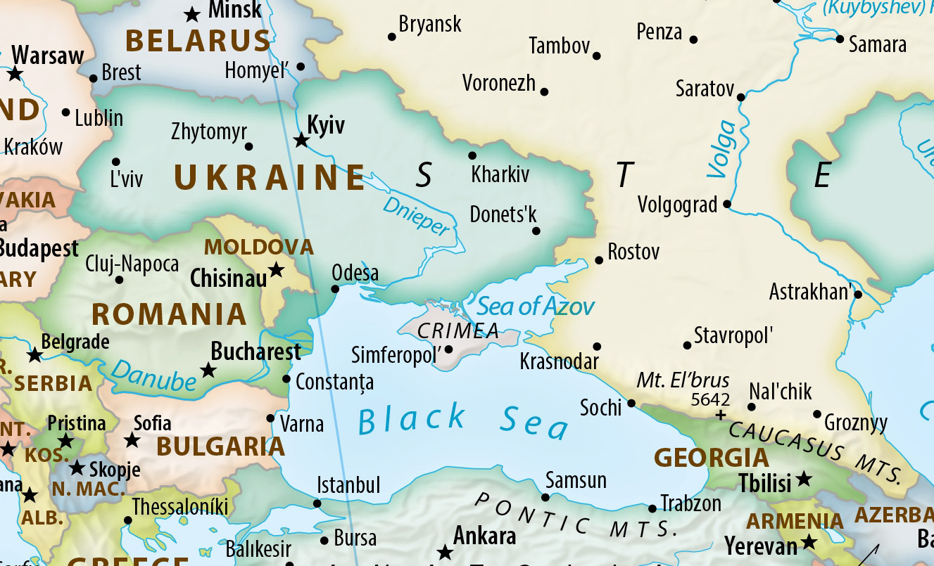
2. Projection and territorial vision are not the same thing.
Following the project devoted to the Equal Earth projection (equalearthlab.com), another website with a similar name (equal-earth.com) emerged, offering political maps using this projection. It appears to be a continuation of the work of the same team – at least, one of the map’s authors is identified as Tom Patterson, one of the three developers of the Equal Earth projection.
On the map, Crimea is shown not only in an equal-area projection but also with a particular territorial treatment: as the map’s authors state, “Russian occupied Crimea is shown in neutral gray.”
Based on materials from Equal Earth, Political Wall Map.
The United Kingdom, for its part, also pointed to a problem. Its representative said that it does not consider map projections in themselves to constitute a historical injustice requiring correction through the UN.
And then came the most concrete statement: “Crimea is Ukraine. Russia invaded Crimea by force, and its attempted annexation is illegal, null and void. The United Kingdom does not recognise, and will never recognise, Russia's claim to Crimea or any other Ukrainian territory”. At the same time, London emphasized separately that the resolution itself does not determine questions of sovereignty, the status of territories or internationally recognized borders.
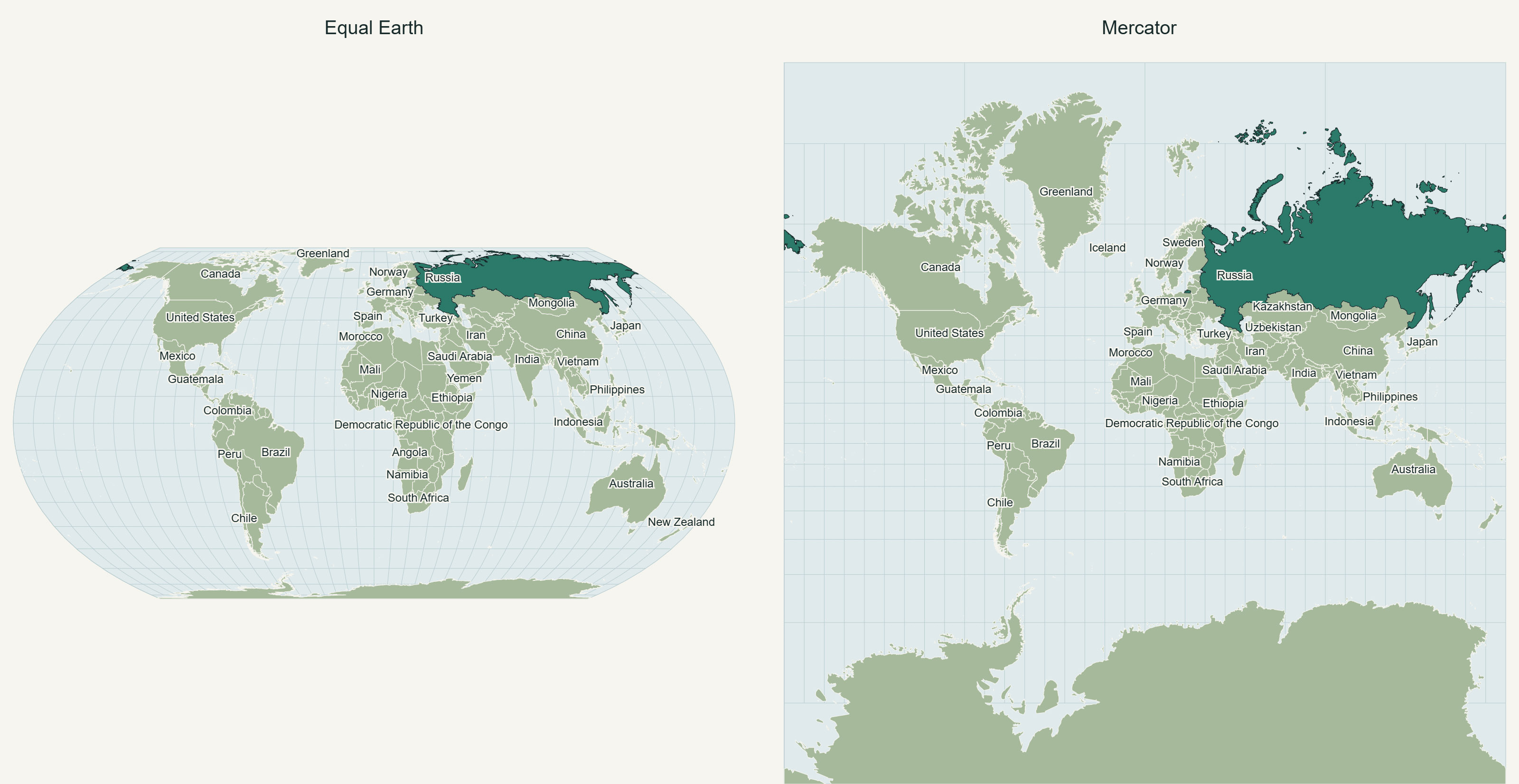
What is bad for some is good for others. The Russian representative could hardly contain her delight on behalf of the African countries. Never mind that Russia itself will be smaller on such a map – visually, almost by half – and will become much more “northern” – which, incidentally, also has certain historical connotations. And the world will perhaps become more “southern” and, accordingly, “hotter.”
Here it is appropriate to quote the Russian delegate. Firmly and without prompting, she stated that Russia “consistent in its advocacy for overcoming the legacy of colonialism, and we support combating the practice of neocolonialism as well”. Judging by the situation, preparations for this are well underway. And credit where credit is due – Russians like grand scale and never look for easy paths. So one can only wish our neighbor from the far north success in this endeavor.
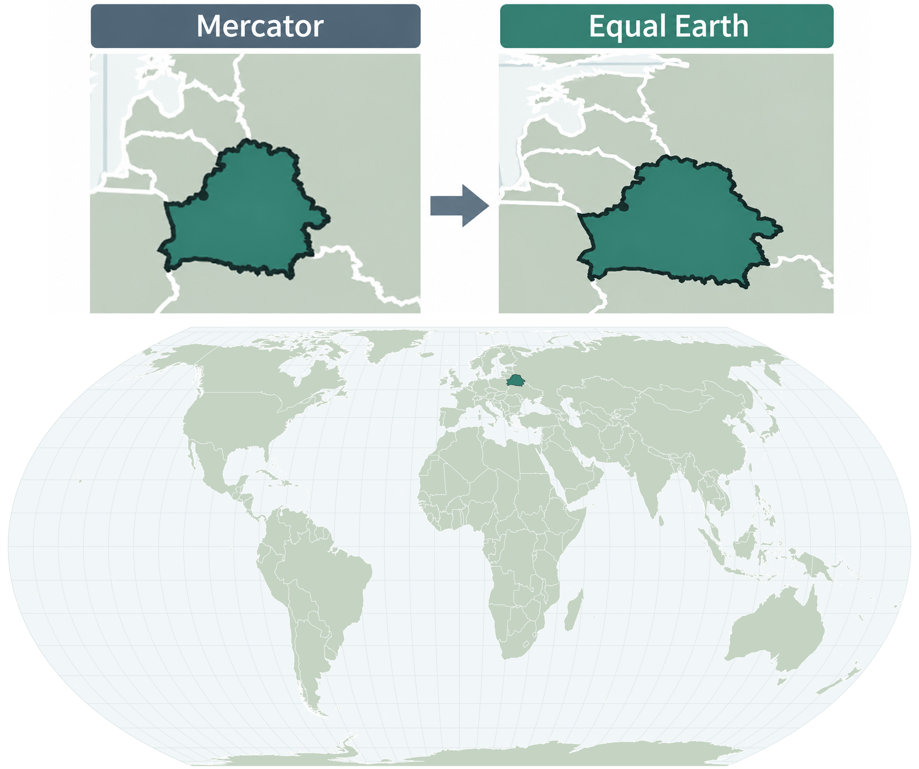
Belarus also supported the resolution. On the “Correct Map,” the outline of Belarus looks slightly different from what we are used to – somewhat elongated, but still recognizable.
The outline of a state always remains one of a country’s informal but fairly enduring symbols. An interesting effect: most countries can probably be recognized from their outline alone primarily by their own citizens. Unless, of course, it is Italy or, for example, Chile.
The outline of Belarus is quite popular and in demand both among the diaspora and inside the country – in jewelry, souvenirs and all sorts of other things. This outline took the place of the hammer and sickle on the Soviet emblem of the Byelorussian SSR and now “adorns” the coat of arms of the Republic of Belarus, as well as money and other attributes of power.
There is even an example in architecture – the design of the new building of the National Historical Museum of Belarus, when viewed from above, will have the outline of Belarus. The main entrance to the museum is “from the side of Ukraine.” It is too early to speak about this symbolism; it is more likely that such an arrangement of the building is simply more natural.
Nevertheless, if the “Correct Map” really comes into use, it will take quite some time for this slightly altered symbol to become part of everyday life. If, of course, we manage to keep up with a changing world. For even the north-up orientation of maps, heaven forbid, can also be interpreted as a legacy of the European scientific tradition and, to some extent, of colonialism.
But all this is an attempt to joke about geopolitical problems that have already become unbearable for real people. So, for the sake of fairness, let us note that this decision is nevertheless more in the same category as the one about the “inseparability” of plastic bottle caps.
Probably no one – and above all the global technology platforms – will even pay attention to it; at best, they will make local adjustments. The specially created website for the Correct Map, along with a range of other maps that differ from familiar ones in various ways, also offers those involved an excellent opportunity to generate revenue.
The map, of course, touched on political borders and provoked mutual accusations, but there are more than enough reasons for conflict even without it. Nevertheless, it seems that the media, writing about this “Correct Map,” sensed something left unsaid but never quite found it. Although this is a universal case, highly characteristic of maps in general.
Maps have a tendency for their content to “flow” into meanings, regardless of the historical situation or era.
On medieval maps we see reality as it was – full of wonders and mysteries – and, of course, within the geographical canons of Holy Scripture, with Jerusalem at the center and Christ Pantocrator ready to forgive this world everything.
In the early modern period, we create Ptolemy’s Atlas under the patronage of the Papal See – so that we can finally sort out all these “clever astronomers” and somehow reconcile it with Holy Scripture. But at the same time, we record the division of the colonies between Spain and Portugal.
In the age of competing national narratives, maps remain geographical, but we argue endlessly over whose observatory – and therefore through which country – the prime meridian should pass.
And so it is now. On the one hand, the resolution repeatedly emphasizes that it has no bearing on questions of sovereignty, territorial integrity, state borders, and so on. On the other hand, we acknowledge that previous maps were unfair and require revision. On the one hand, “does not concern borders”; on the other – “neutral gray.”
And this, it seems, is precisely the elusive and unspoken thing in the story of Correct the Map.
| Наступны > |
|---|